Final Project

IMG_7929

IMG_7930

IMG_7931IMG_7932

Chris O’Connor

2D Design

Prof. Claudia

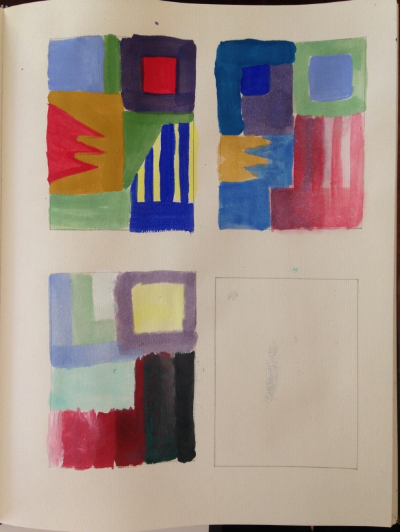
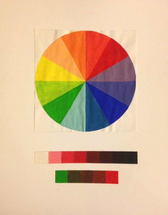
My design is comprised entirely of implied lines when creating the shapes, as the colors define their borders. I have a full value range of red on the top-right of my design going from dark red to light red as it ascends, which is contrasted by a sky blue it competes with visually. It guides the eye to the left yellow square outlined with a purple border, which utilizes simultaneous contrast of colors opposite on the color wheel to produce a popping yellow. Many other colors of the color wheel are included across the picture plane such as analogous colors of green and forest green in the bottom right. There are neutral colors of a brown and grayish green by the yellow-purple square, and the grayish green shape extends towards the viewer to accomplish depth, and the orange squares within it compliment this effect as they decrease in size getting further away. They also overlap other lines and get lighter coming closer to the viewer. This area is like a shadow to the focal point yellow square.


Exercise 3: Perspective

The rules for one-point perspective are to have one horizontal line, and one vanishing point, a point at which all diagonal lines must intersect. All vertical lines must be perpendicular to the horizon, and all horizontal lines must be parallel to the horizon. My drawing of a cityscape in Part 5 adheres to these rules, every diagonal line in the buildings if extended would intersect the vanishing point, the diagonal lines in the road intersect the vanishing point, the horizontal lines in the buildings are parallel with the horizon, and the vertical lines of the buildings are perpendicular to the horizon. The rules of two-point perspective are similar except that you are dealing with two vanishing points at opposite sides of the page that diagonal lines must recede into. My building drawing from Part 10 adheres to these rules as the diagonal lines from the building and road intersect with their respective vanishing points.

Project 8: Color Schemes

Image

mono

analogous

complementary

For my monochromatic scheme, I used yellow, white and black to create 9 values of the yellow color. The more intense, and browner yellows created shadows and tinted light yellows were used for highlights on the face. For my analogous scheme, I used blue, teal, green, white, and black to make 9 different colors. The deep blues create shadows and color the dark features in my hair and eyebrows, and the light greens and teals create highlights like on my nose and forehead. For my complementary scheme, I used red, green, and black and white to create 9 different colors. The cool greens were used to create highlights and became browns as I mixed with red to create midtones to shadows. Red takes over as a warm color for the dark hair and shadows in the neck and eyes. The darkest red is the color of my glasses, normally black in real life.

Exercise 4: Color Wheel

Color Wheel

The words “hue” and “color” are very similar in definition and are nearly interchangeable except that “color” is more vague and can used to refer to tints, shades, and tones. “Hue” can only be used to refer to the root color, whether it be Blue, Red, Yellow, etc, and has nothing to do with intensity, lightness or darkness of a color. Complementary colors are colors opposite each other on the color wheel. For example, Red and Green, Blue and Orange, Yellow and Violet. When mixed together, these colors create a neutral brown. Tint is to add white to a hue, shade is to add black to a hue. Simultaneous Contrast is the effect two colors next to each other have on our perception. A yellow square surrounded by purple will appear more intense than a yellow square surrounded by a light green color, for example. This is because complementary colors make each other pop, they create a strong contrast.

Project 7: Value Self-Portrait

IMG_7490

The portrait is occupying the whole area of the composition. All 9 values from my visual scale are present. A broad value scale has been established. The portrait breaks each value into a flat plane. The grid was properly utilized in correctly placing the shapes. The facial features are defined by their values not by outlines. The final design has been executed in a professional manner.

Project 6: Texture

Image

Project 6

The focal point of this design is the largest circle shape made of garbage bag material in the top right section. It is highlighted by the repeated lines that surround it, made with the PITT pens, which begin rectilinear from the edge of the paper and become curvilinear as they circle around the shape. The corner of the paper beyond that is blacked out, to draw more attention to this area. A visual flow starts from the focal shape as the eye follows every curvilinear line sprouting from it, also made of the same material, ending in more circular shapes. Electric pen marks also emanate from the focal mass. The largest, most emphasized circle with tin foil around it captures the eye and draws it into the bottom portion, where we find wild strips of bag material, light pen stippling and light pen lines. This area is chaotic and evokes a feeling of destruction. The cotton pieces reinforce the chaotic theme and fill in necessary areas. They also create a layering of transparency. Proper techniques were used for gluing and cutting that create a professional design. The paper was aligned to the bristol board correctly.

Project 5: Directional Dominance

Image

IMG_2250

The design includes a focal point at the near-center where the triangular shapes converge. It is emphasized by the hatching it overlaps and by the open white space. The circular shapes surrounding it appear in the foreground, and they follow a visual path that starts from the top left to the bottom right. The bottom right circular shape is isolated from the pair and smaller. The hatching lines help lead the eye through this curved path. There is strong directional dominance in the converging triangle shapes. The directional conflict is the hatching in the top left section that betrays the visual flow. Implied lines can be seen in the circular shapes as they have no outline. They are defined by the stippling and by the hatching that surrounds them. My design includes a full range of stippling in the circular shapes. More ranges of value in the hatching could have been made, and differences in the line thickness with the triangular shapes, possibly to draw more focus to them as they create the focal point. The outlines of those shapes could have been omitted and changed to implied lines. The final design has been executed in a clean professional manner, glued appropriately, and cut cleanly.

Project 4: Shape & Space Compositions

Project 4
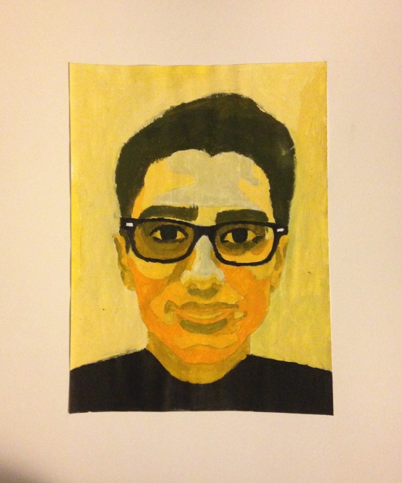
The figure/ground relationships are evident in this design and each of the black and white shapes compete to act as positive and negative space. The composition contains 50/50 white and black shapes. Both sides are a mirror image of each other exactly. I used a balance of a wavy shape to outline the tear shapes and made spiky wing designs at the top to flare the design out. The successful aspects of my design are the spiked and curvilinear lines that create interest, and how smooth some of those curves look. There aren’t many unsuccessful aspects about this work. The craft is clean and paper glued without any residue showing. The sizes are correct and the paper centered in the right place.
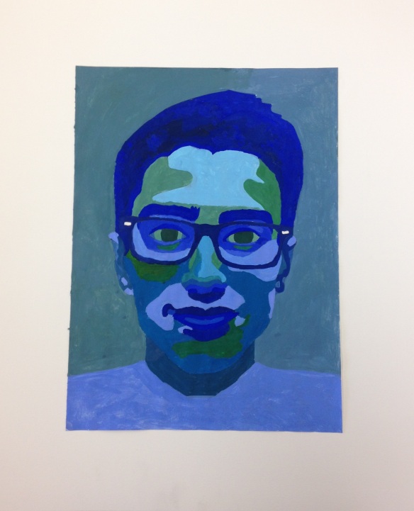
Project 3: Variation of Line

Project 3

The primary focal point of this design is the top right curvilinear loop, and down the bold two lines it connects to. Many of the bold lines attract high attention. And these lines guide the eye throughout the work. If you follow those two bold lines it brings your eye to the swirly thinner line that eventually takes you back up the three repeating but varied scoops of dark curved lines. Those then take you to the electric lines that move up, and back down to the rest of the lines on the left side of the design. The three lines in my design are electric, bloody and swirly. The entire space is activated and used. Some shapes are created within lines like in the center, in the drooping three lines and many lines behind them. Many more shapes can be found between other overlapping lines all over the work. Successful parts of my design are the variations in thickness and character of the lines. The final design has been executed professionally, glue is applied evenly, paper is cut cleanly, and paper was arranged properly on the bristol board.

Project 2: Dynamic Compositions

kkk

This design has a primary focal point in the circle. It is oriented in one of the four prime locations for focal points via the Rule of Thirds. The eye immediately attracts to this circle and more specifically the rectangular shape within it (reflective light) and is then led down to the thick line below it, and the two thinner lines beneath that. There is repetition with variation in these lines, thickness being the changing variable. There’s also repetition in the multiple circles. I used various pitt pens for varying thickness in the lines. The focal point is successful, the shakiness/unevenness of some of the lines (smaller circles) could have been done better. Maybe have used a ruler for the bottom lines to straighten them out. Care went into gluing and aligning the Bristol board with the borders of the paper base.